Inspiration · 3 min read
Find your wallpaper style: color, calm, or a little surprise
A practical way to choose a background you enjoy looking at, without losing your clock, icons or sense of style in the picture.
Choose a wallpaper by its main color, focal point and the space it leaves for your clock and app icons. Preview it on your actual screen. If a detailed image makes labels hard to read, try it on the lock screen and use a quieter home screen background.
Begin with the feeling, not the category
You do not need a permanent aesthetic to choose a wallpaper. Start with a simpler question: what would you enjoy seeing the next time you unlock your phone? A forest can feel like a small pause. A vivid gradient can bring energy. An unusual illustration can make a familiar device feel a little less routine.
Paxpi’s collections, tags and search are different ways into that choice. Browse broadly at first, then follow the colors or subjects you keep returning to. The category is a starting point, rather than a rule you have to follow.
Give color one job at a time
When several images appeal to you, notice their strongest color. Do you want that color to stand out, or quietly support the rest of your screen? A bold orange shape feels different when it fills the display than when it appears as a small highlight.
Try choosing one main color and letting the other colors stay quieter. This can help an expressive wallpaper feel intentional rather than crowded. If the image competes with every app icon, use it on the lock screen and choose a simpler companion for the home screen.
A quiet background can still have character
Simple does not have to mean empty. A soft landscape, a gradual shift in color, or one strong shape can give your phone a distinct mood while leaving space for information.
Look at your usual widget and icon arrangement. If much of the display is occupied, an image with fewer small details may be easier to live with. If you keep your home screen sparse, you might have room for a more detailed piece of artwork.
Match the screens, or give each a role
Using one wallpaper on both screens can make the phone feel cohesive. Two different images can work just as well when they share a color, a style or a sense of light.
For example, pair a detailed illustrated scene on the lock screen with an abstract background in a similar palette on the home screen. You keep the same general feeling while giving each image a different role. Your phone’s available home and lock screen options determine how you can apply that pairing.
Check it in an ordinary moment
After applying a wallpaper, use the phone as you normally would. Can you read the clock at a glance? Are icon labels comfortable to find? Does an important part of the picture sit behind a notification?
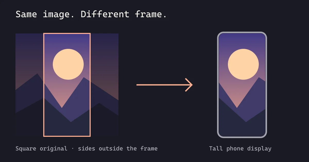
You are choosing a background for a working screen, not only a picture to admire. If something feels awkward, adjust your choice. Another image with the same mood may fit the screen better. Our article on wallpaper cropping explains how composition and screen shape interact.
Keep a few alternatives
Save images you like to your gallery so changing your mind is easy. You might want a quieter background during a busy week and something brighter later. There is no need to find the single perfect choice.
Explore wallpaper styles in Paxpi, or follow the Android wallpaper walkthrough when you are ready to apply your next look.